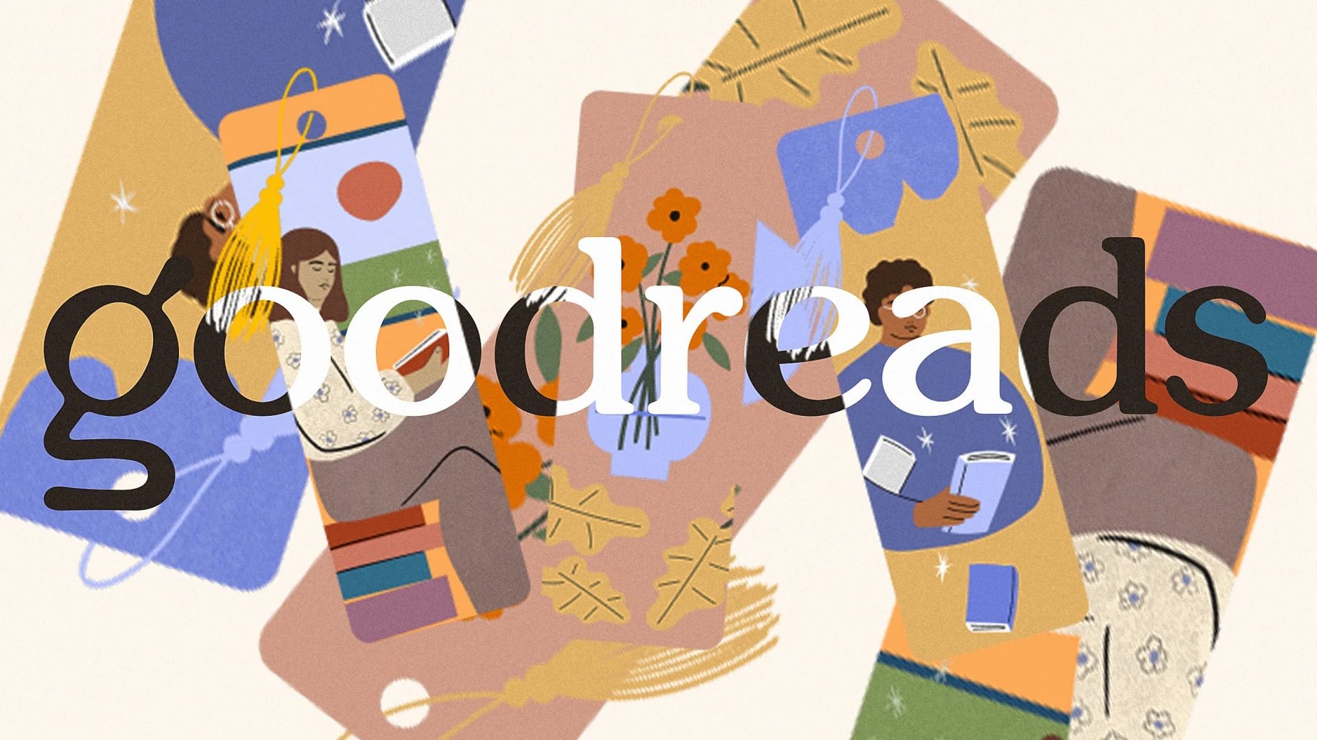
"Our new logo is designed to better represent Goodreads and is optimized for accessibility so it looks clear and sharp no matter where you see it—from your phone to a billboard."
"The lowercase 'g' incorporates a magnifying glass over an open book, symbolizing the book discovery and sharing of perspectives that are at the heart of the Goodreads experience."
"The previous logo was the saddest on my Home Screen, I like the new one. I hope it translates in the rest of the app."
"It's a good sign that they're trying to implement some changes that I hope to be for the better; the site (and app) were practically frozen in time!"
Goodreads has launched a new logo and branding, marking a shift from its previously clunky design. The new lowercase 'g' is stylized, featuring a magnifying glass over an open book to symbolize book discovery. Typography across the platform has been updated to look friendlier and more literary. Users have responded positively to the new logo, expressing hope that it signals further updates to the overall user interface, which had been perceived as outdated.
Read at Creative Bloq
Unable to calculate read time
Collection
[
|
...
]