"Cravens has an incredible story - one grounded in relationships and high quality. Our job was to elevate those strengths through design that tells their story in a modern, visually engaging way. The new Cravens bags lean heavily on tone-on-tone illustration, using a warm, muted palette with subtle patterns wrapping the package in repeating figures and botanical forms."
"SMC developed custom illustrations to highlight the farmers, plants and environments where Cravens' beans are grown, reinforcing the roasting company's emphasis on long-term sourcing relationships with coffee producers. Short callouts on the bags read Quality takes work. It sure is worth it and Respect the farmer. Reveal the flavor. Reward the drinker."
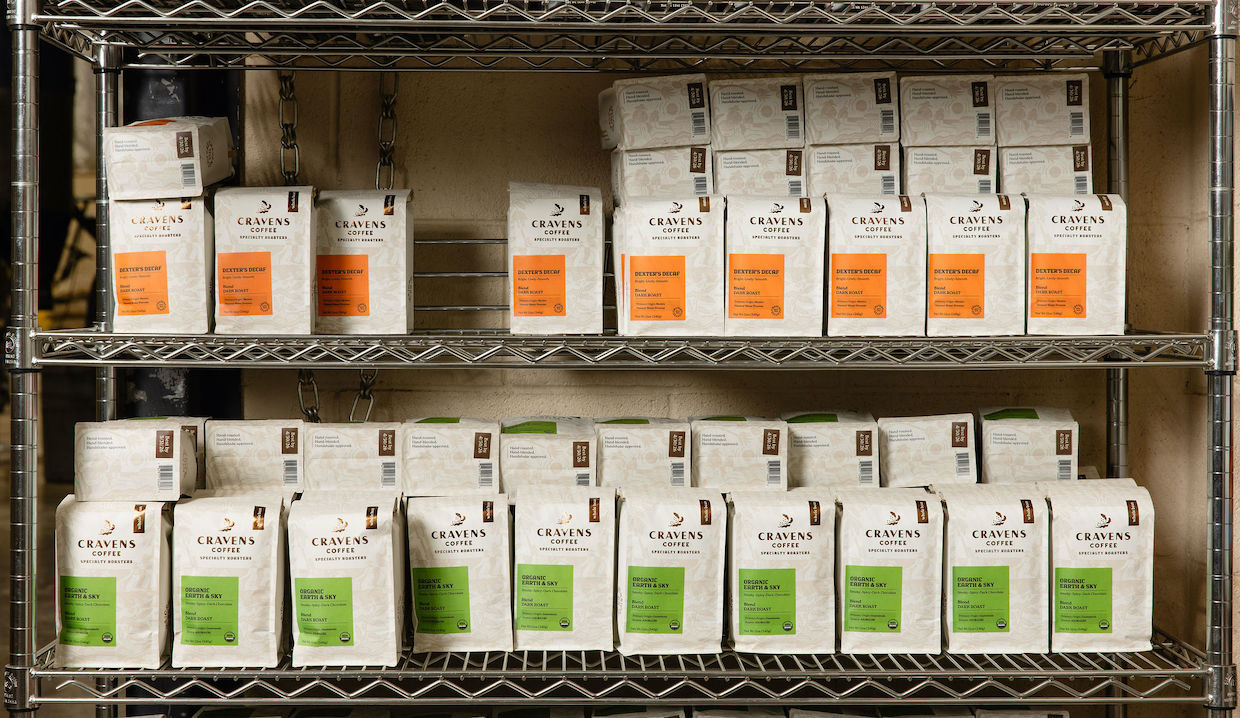
Cravens Coffee, a Spokane-based roaster operating since 1993, underwent a complete brand identity refresh with creative firm Sally Morrow Creative. The new packaging design emphasizes the company's quality-focused legacy and relationship-driven sourcing model. Custom tone-on-tone illustrations feature coffee leaves, fruit, and farm work imagery that highlight the farmers, plants, and environments where beans originate. The design uses a warm, muted palette with repeating botanical patterns. Callouts on the bags reinforce core values: "Quality takes work. It sure is worth it" and "Respect the farmer. Reveal the flavor. Reward the drinker." On shelves, crisp rectangular color blocks create strong visual impact while maintaining the brand's commitment to transparency about coffee sourcing and production.
Read at Daily Coffee News by Roast Magazine
Unable to calculate read time
Collection
[
|
...
]