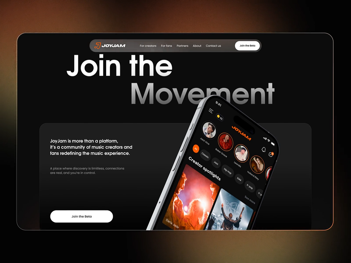
"Expectation: Came, saw, conquered. Reality: Logged in, got confused, left. That's pretty much what happens when you run into a poorly designed interface. The only "intuition" you feel is the urge to run away. So what does confusion really look like? It's not one single obstacle. It's a whole pile of rocks scattered across the user's path. And people don't always leave right away. Sometimes they give up after a few failed attempts."
"A truly intuitive interface comes only from systematic work: taking into account the business goals, the product itself, and the way your audience thinks. A template ≠ an intuitive interface Think of an intuitive interface as a map you can easily follow. Yes, intuition means predictability: people know where to find the menu or what happens when they click a button."
Confusion in interfaces appears as many small obstacles that accumulate and frustrate users, sometimes causing them to leave after repeated failed attempts. Clarity requires deliberate, systematic work that balances business goals, product needs, and audience thinking rather than relying on templates or quick fixes. Predictability helps users know where controls and outcomes are, but predictability alone does not guarantee clarity. Visual quality sets the tone and trust level; poor visuals increase cognitive load and make even simple tasks harder, undermining otherwise good structure and navigation.
Read at Medium
Unable to calculate read time
Collection
[
|
...
]