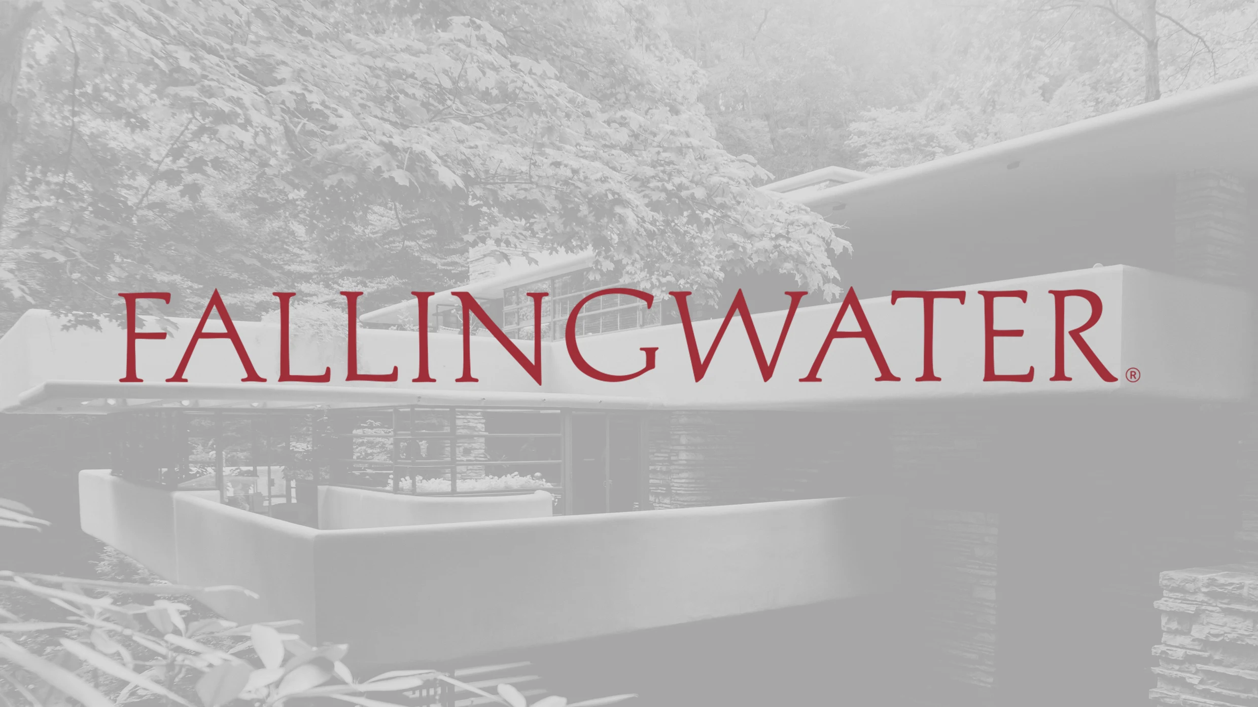
"A logo's purpose is to provide a cognitive shortcut to brand essence—but Fallingwater's iconic elements, the cantilevered house and its landscape, are too rich to compress graphically, yet too essential to abstract."
"That iconic view of the house floating over the falls is the power of our visual identity. When you try and distill that image into a graphic depiction, it doesn't do it justice."
"Instead of trying to represent that famous POV of the house over its namesake falling water in a new way, the solution was a wordmark."
Fallingwater has undergone a rebranding that intentionally excludes a logo, as its architectural elements are too complex to represent graphically. The new brand features updated fonts and a color palette inspired by nature. The iconic view of the house over the falls serves as its visual identity. Past logos attempted to depict the house literally or abstractly, but the new approach uses a customized wordmark in Aldus Roman typeface, connecting to its historical significance and the original book about the house.
Read at Fast Company
Unable to calculate read time
Collection
[
|
...
]