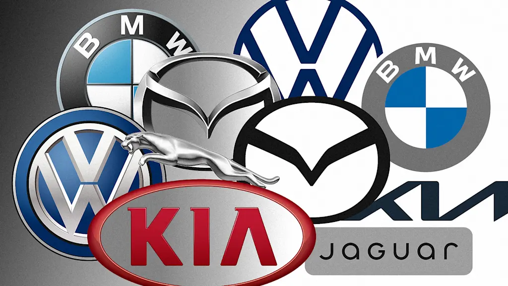
"Mazda Motor Corp. rolled out a new, flatter version of its logo at the Japan Mobility Show 2025 in October that did away with the dimensional, beveled silver chrome effect the logomark used to have in favor of a solid black line. The new M mark is more angular, too, evoking a pair of wings that was first introduced in 1997. The company says it designed the flat new logo for improved visibility, especially in digital environments. That also makes it late to the party."
"A dozen car brands have flattened their logos in roughly the past half dozen years, and Mazda is now the latest. Toyota did so in 2019; Rolls Royce in 2020; BMW, Cadillac, Kia, Nissan, and Volvo in 2021; Audi and Bugatti in 2022; and Genesis and Jaguar Land Rover in 2023. Jaguar famously introduced its new, lighter logo with a mix of upper- and lowercase letters in 2024; and this March, Lamborghini toned down the sheen on its bull-and-shield logo."
"Overall, a "blanding" and flattening of car branding has swept through the industry years after the trend hit graphic design more broadly. Out are chrome, 3D, skeuomorphic logos designed to look like car badges. In are logos meant to be rendered at small sizes on screens. Now de-chromed, these new logos are thinner and lighter, and they come as automakers adapt to a more electric future."
Mazda introduced a flatter, more angular M logo at the Japan Mobility Show 2025, replacing a beveled silver chrome effect with a solid black line and referencing a 1997 wing motif. The redesign prioritizes legibility at small sizes and in digital environments. A broad industry trend has seen numerous legacy automakers simplify or flatten their marks, removing chrome and skeuomorphic details in favor of thinner, lighter designs. These changes align with the shift toward electrified lineups and the need for logos that render clearly on screens and digital interfaces.
Read at Fast Company
Unable to calculate read time
Collection
[
|
...
]