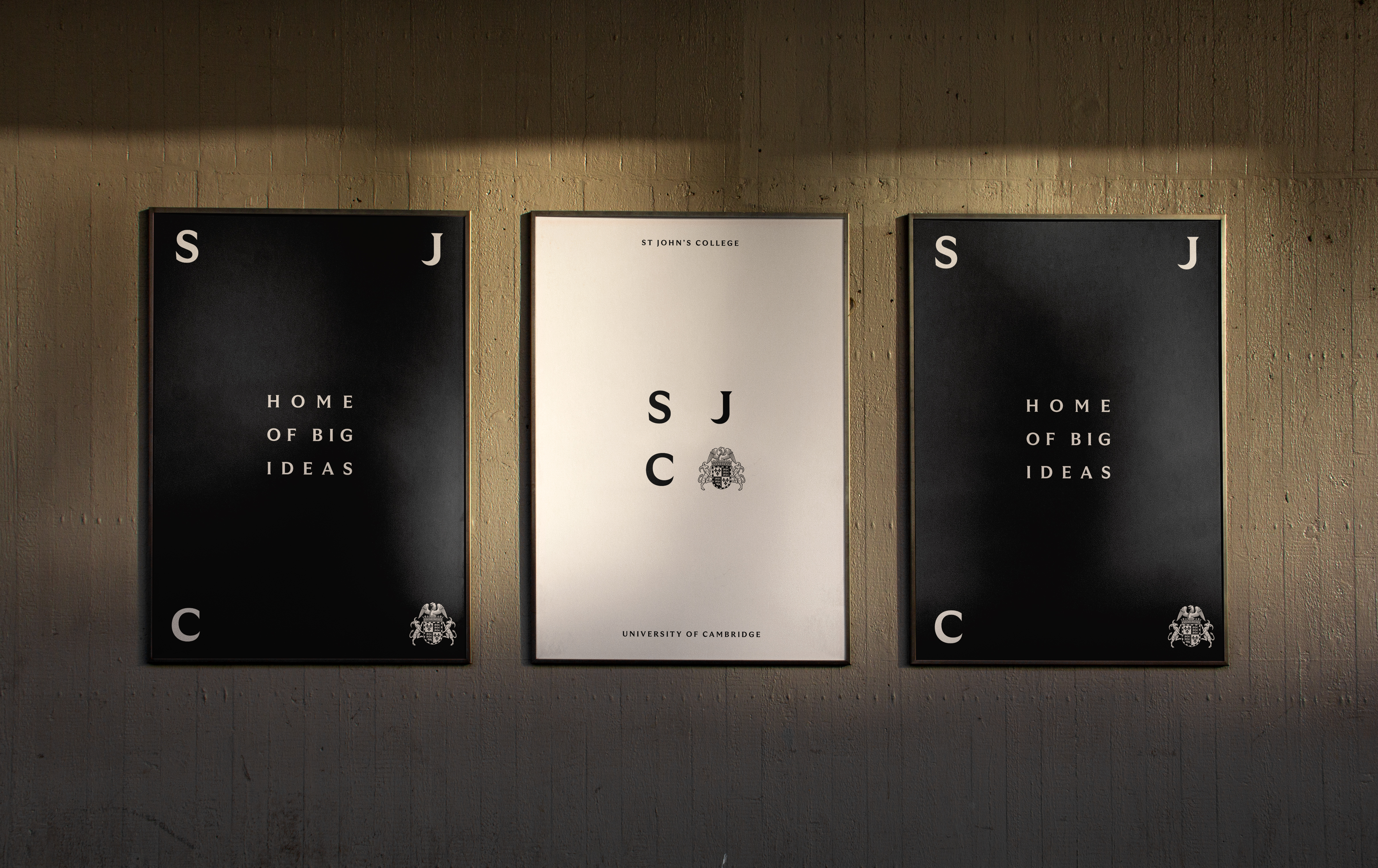
"Re-crafting and optimising the crest was a must, but establishing a more cinematic and inviting tone was key to appealing to today's audience."
"A bespoke monogram drawn from the floor plan of Second Court was also created, transforming into a flexible design grid used across print and digital to harmonise past and present."
Rebranding St. John's College effectively balances historical heritage and modern appeal. The redesign includes a polished crest, a new colour scheme, and a bespoke monogram. The branding process involved analyzing archives and embracing a contemporary aesthetic. The design team optimized the college's iconic crest to create a flexible identity, highlighting warmth and modernity. A simplified black and white colour scheme conveys class and authority. Expansive typography and impactful video contribute to a modern portrayal that resonates with today's audience.
Read at Creative Bloq
Unable to calculate read time
Collection
[
|
...
]