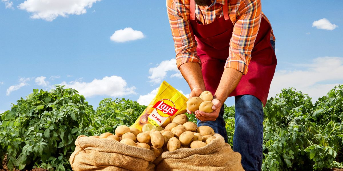
"Lay's spends up to nine years creating the best potato for farmers to grow that can deliver the perfect crisp, flavor, and golden glow when sliced and cooked. The potatoes' journey from the soil to the shelf is the heart of Lay's. But here's the surprising part - 42% of people who enjoy Lay's don't realize they're made with real, farm-grown potatoes."
In time for national seafood month, Kentucky-based chain announced that it's dropping the golden yellow fish illustration for a similarly styled chicken illustration. It's also adding the words "Chicken" and "Seafood" to its lock-up. "Guests have been telling us for years that our chicken is a best-kept secret," Long John Silver's senior vice president of marketing and innovation Christopher Caudill said in a statement. "It's time we let that secret out."
Google is making the gradient "G" its new company-wide logo, according to an announcement on Monday. The new logo first began to surface across the Google app on Android and iOS in May, but soon, the design will begin to appear across all of the company's platforms, marking Google's first big logo change in 10 years. Google separated the red, yellow, green, and blue in the colorful "G" logo it introduced in 2015.
Fidium is now the official name of the company formerly known as Consolidated Communications. Prior to the name change, the provider used the Fidium name as a brand for its fiber broadband service for several years. "Fidium is now the new name and face of our company, representing our fiber internet and network services capabilities across consumer, commercial and carrier lines of business," said a Fidium spokesperson in an email to Telecompetitor.
"It came with some great loyal customers that loved the coffee but the shops themselves needed a lot of work," Alex Nelson recently told Daily Coffee News. "We came in and remodeled all the shops, and with the fresh new looks we wanted a fresh new name that stuck out to people and they could see how much work we had put into them."
Azerion, the leading European digital advertising company, is proud to announce a comprehensive rebranding, unveiling a fresh visual identity, a newly designed website, and a revitalised presence across social platforms, highlighted by the brand's dynamic new tagline 'Everyone. Everywhere'. This rebranding marks a significant milestone in Azerion's journey, reflecting its evolution into a more accessible, globally connected platform. Azerion connects audiences to advertisers using proprietary technology, local expertise, and premium inventory to drive measurable omnichannel outcomes in the places that matter to clients. This refined brand promise is core to Azerion's new identity: combining human connection with digital innovation to help clients succeed across channels, formats, and geographies.
While I'm not typically a fan of minimalist design, some brands call for stripped-back branding, and one company that's nailing the aesthetic is Blank Street. A Gen Z favourite, the laidback highstreet coffee store knows its customers to a tee, championing chic, lowkey vibes with a deliciously Instagrammable aesthetic. Recently unveiling its slick new rebrand, Blank Street reestablishes itself as a global lifestyle brand, owning its identity as a cult favourite.
"Brand is the thread that connects every part of an organisation together and shows what it stands for," says Tosh Hall, global chief creative officer at JKR. "For Blood Cancer United, that meant creating a brand united for all. That spirit now runs through everything, from the name to the design systems to the behaviours, building unity for the work it does and, most importantly, speaking to everyone touched by blood cancer."
It was supposed to be a simple rebrand or so Cracker Barrel thought. Earlier this month, the 56-year-old southern restaurant chain known for its country-store charm and nostalgic Americana aesthetic unveiled a new look: a minimalist logo, more modern interiors and a handful of new menu items. Gone was the familiar image of Uncle Herschel, the old man in overalls leaning against a wooden barrel.
Back when the dating app first launched in 2012, it was a completely anonymous hookup app - a "quick and safe way to find sex right now," according to one tagline from back in the day. But Pure has since pivoted to what Chantal Pesulima, the app's director of integrated marketing, calls a "full-blown dating app" focused on sexual openness, mutual consent and safety.
Ocean Casino Resort represents a shift in Atlantic City's identity, transitioning from a once run-down destination to a sophisticated and upscale locale catering to luxury-seeking visitors.
When you're thinking about how you want to rebrand yourself, it's not just about your aesthetic or your job title - it's about realigning your public image with who you are becoming professionally and personally.