"PepsiCo, the food and bev giant behind childhood favorites like 7UP, Mountain Dew, Lay's, and Doritos, just got new branding, and it looks nothing like its namesake product. The new PepsiCo brand identity, which includes a fresh wordmark, logo, and tagline, is the company's first rebrand since 2001. The company has had three different corporate identities since its inception in 1965, and all of them have taken their most prominent design cues from Pepsi, the soda brand that started it all-until now."
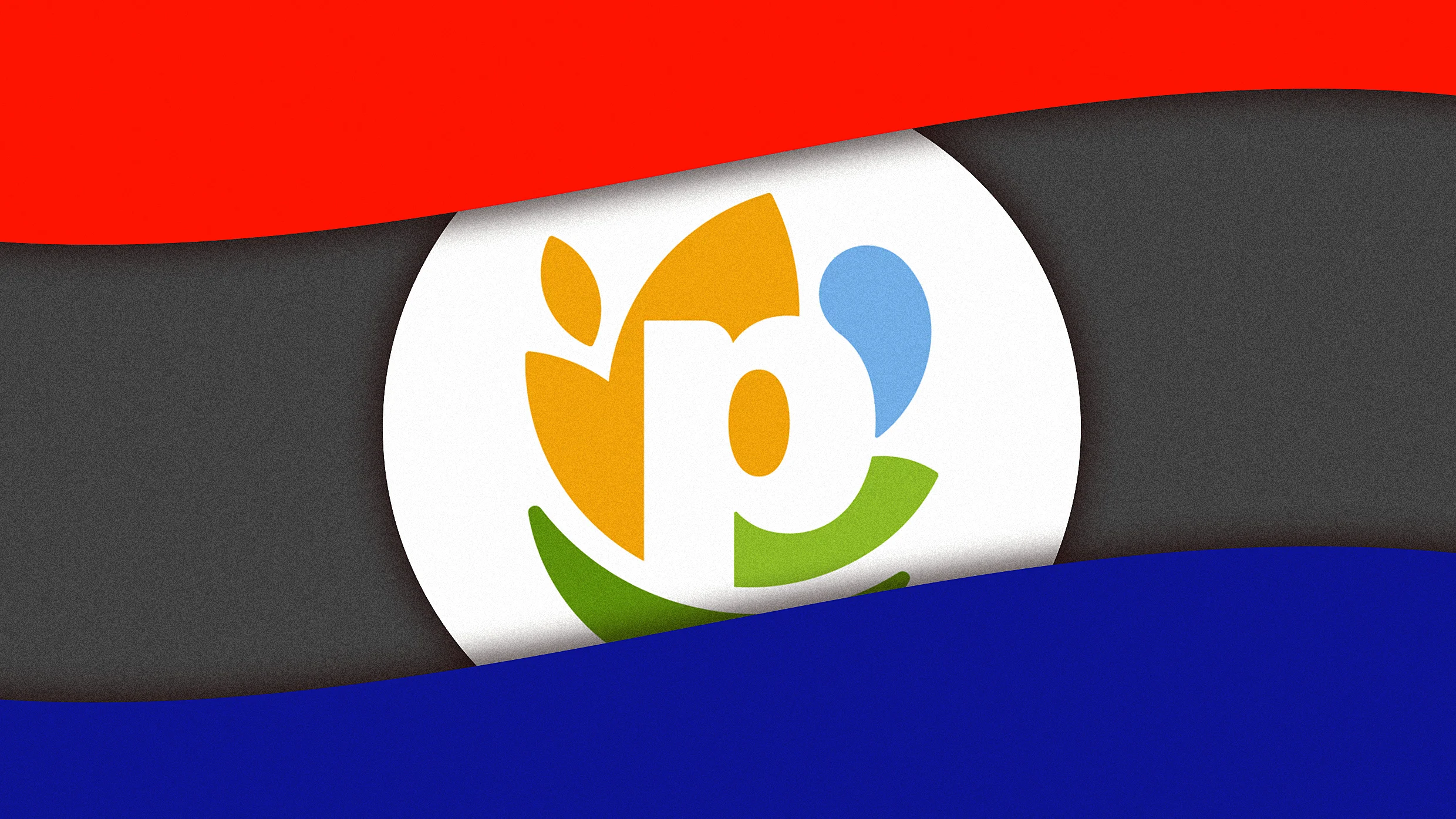
"The new PepsiCo logo is a white lowercase "p" surrounded by several different forms. On the left is a burnt yellow motif, which, according to PepsiCo's description, represents food and grains, a concept "rooted in agriculture." To the right is a light blue blob, signifying drinks and water, as well as a light green leaf, denoting "positive impact for people and planet." And on the bottom of the "p" is a forest green smile, which stands for "consumer-centricity.""
PepsiCo unveiled a new corporate identity—its first since 2001—to reflect a portfolio of more than 500 brands and a strategic shift toward healthier offerings and value-oriented serving sizes. The redesign abandons the Pepsi soda–centric blue and red palette and Pepsi-coded fonts in favor of colorful, abstract shapes that symbolize different business areas. The mark features a white lowercase "p" surrounded by burnt yellow for food and grains, light blue for drinks and water, light green for positive environmental and social impact, and a forest green smile for consumer-centricity. A new all-lowercase, curvy wordmark accompanies the logo.
Read at Fast Company
Unable to calculate read time
Collection
[
|
...
]