"Retaining the original diagonal logo symbolizes the neighborhood's unconventional spirit, while the new tape graphic embodies Dumbo's rich history and creativity."
"The tape design reflects the ingenuity of Dumbo, illustrating its transformative energy and revealing new perspectives through innovative graphic elements."
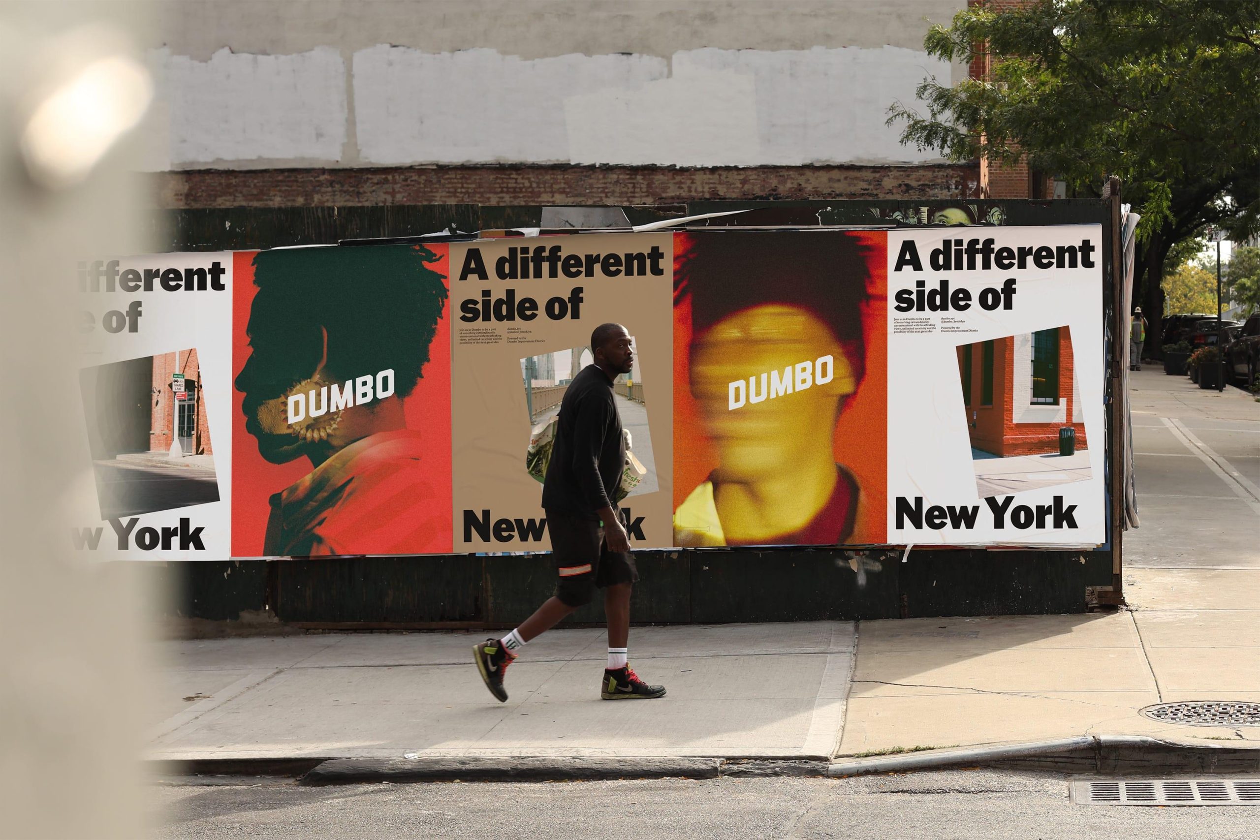
The brand refresh for Dumbo retained its original diagonal logo, symbolizing the neighborhood's unconventional spirit, while introducing a new tape graphic inspired by its history. The tape design incorporates elements of the humble cardboard box, a significant invention of the area, reflecting Dumbo's creativity and ingenuity. This graphic moves energetically and offers fresh perspectives, paralleling the vibrant character of Dumbo itself. The design journey begins with abstract illustrations influenced by local architecture, culminating in a versatile system for typography and graphics that resonates with the local context.
Read at DNCO
Unable to calculate read time
Collection
[
|
...
]