Typography

[ follow ]
fromItsnicethat
14 hours ago

Bold.af: the Affinity rebrand blends personality and precision, relaunching with a bang

"When used light and small, it's super precise and premium; in its big, fat, expressive italic form, it looks more bold and a bit weird," Tom explains. Overall the tone of voice is packed with wit and in-jokes, from its copywriting down to its new file name, .af - which apart from being on every file you export from the programme, is also used in myriad, tongue-in-cheek ways across merch, such as its "Sketchy.af" notebook.
Typography
Typography
fromColossal
3 days ago

Pop-Up Letters Set the 'Alphabet in Motion' in Kelli Anderson's Playful Book

A communication designer created an interactive pop-up book, Alphabet in Motion, revealing typography's evolution through tactile, kinetic letterforms and archival research.
#generative-design
fromMission Local
14 hours ago

What's on now at San Francisco museums, November 2025

There's a lot going on here. Through this weekend, there is a Behind-the-Screams Tour, where guests will face skeletons, parasites, bloodsuckers, and more from the collection. The newly renovated Wilson Family Nature Lab is opened in mid-October with lots of hands-on learning. Coming up on Nov. 22, there is a one-night only Welcome Winter Night, with two baby reindeer (and a naming contest), magic shows, and lots of other activities.
Typography
Typography
fromMedium
1 week ago

Typography Basics

Typography shapes written language into a visual experience; spacing, anatomy, alignment, and typeface choices determine readability, rhythm, and tone.
Typography
fromItsnicethat
1 week ago

Elizabeth Goodspeed on why design studios are making fonts

Custom type has become central to branding, offering control, originality, and ownership while reshaping the culture and economy of type design.
Typography
fromBusiness Matters
1 week ago

The Most Popular Fonts for Marketers in 2025

Versatile typefaces like Helvetica, Montserrat, Roboto and emerging serifs strengthen brand identity across digital platforms, especially in entertainment and gaming.
#graphic-design
fromItsnicethat
1 week ago
Typography

Ioana Petcu's work in the cultural sector explores linguistics as a lens for graphic design

fromItsnicethat
1 week ago
Typography

Ioana Petcu's work in the cultural sector explores linguistics as a lens for graphic design

Typography
fromCreative Bloq
2 weeks ago

Why fonts matter more than ever in 2025

Generational differences shape how social media users value and use distinctive fonts, with younger users seeking greater font choice to build identity, connection, and boost engagement.
Typography
fromItsnicethat
2 weeks ago

This typeface answers a key question: What if Indian typography refused to play 'catch-up' with the west?

12:40 is a monolinear, grid-based typeface uniting Latin, Devanagari, and Urdu by adapting segmented display constraints into readable, script-respecting glyphs.
fromItsnicethat
2 weeks ago

Harriet Richardson and F37 build a typeface made from three ages of the artist's diary confessionals

Working with F37's Ryan Williamson on the production of the font, the typeface spans three eras of Harriet's writing life: ages four, 13 and 30 years old. The glyphs are an amalgamation of her diary scribblings, which, when included in the typeface, become a an archival project of not only Harriet's stylistic habits but also of the time of writing - there's no hashtags or @'s to be found in thes early texts.
Typography
Typography
fromMedium
3 weeks ago

Your Product Looks Amateur. It's Probably Your Fonts

Limit typography to three complementary fonts with distinct roles to create clean, professional, and trustworthy product design.
Typography
fromFast Company
3 weeks ago

Domino's tasty new tagline is a jingle and logo rolled into one

Domino's refreshed its brand—colors, packaging, and font—and elongated its wordmark with extra "m"s to embed "mmm" craveability into the name.
Typography
fromFast Company
3 weeks ago

Gen Z killed cursive, so Docusign gave us a new way to sign our names

Docusign updated its digital signature styles to reflect declining cursive use and introduce historically inspired, personality-driven script options.
#design
fromMedium
3 weeks ago
Typography

Your Product Looks Amateur. It's Probably Your Fonts

Use a three-font system where each font serves a defined role—body, headings, accent—to create clean, professional, and trustworthy design.
fromCreative Bloq
2 months ago
Typography

A day in the life of self-taught designer Rittsu Kogarasuashi

Rittsu Kogarasuashi exemplifies a self-taught designer who navigates industry challenges through personal projects and collaboration.
Typography
fromColossal
3 weeks ago

From the Creator of Typeknitting, 'Knit Hello' Is a Font and a Knitting Pattern in One

Knit Hello is a typeface that generates knit-ready patterns by typing letters, letting users customize beginner-friendly knitted text designs for hand or machine knitting.
fromItsnicethat
3 weeks ago

This collaborative typeface made from coloured tape is called... (you guessed it) Tapeface

"It's an amazing idea, and it's surprising that it hasn't knowingly been done before. "Tape felt like the perfect tool to disrupt typographic tradition. It's fast, tactile, and unruly," says Varanda. "What fascinated me most was how tape could act as both a restriction and a liberation. It forces letterforms into sharp edges, but in the hands of 27 participants, it created shapes that I could never have imagined alone."
Typography
fromMedium
1 month ago

How design radically transformed a dying industry

This one performance was the creative spark that would ignite a fire in Jacek. He knew right away that he should use design to transform his newspaper from boring text into performance art. Just like a Cirque du Soleil performance. Much like when Einstein was a child and received a magnetic compass as a gift, sparking his lifelong fascination with the invisible forces of nature.
Typography
#type-design
Typography
fromTerence Eden's Blog
1 month ago

Targetting specific characters with CSS rules

CSS can target specific Unicode characters by loading different fonts with @font-face and unicode-range, enabling per-character styling without extra markup.
fromPangram Pangram Foundry
1 month ago

How to create a typographic hierarchy

No matter what you're designing for - maybe it's a website? A brand? A magazine, perhaps? - typographic hierarchy is your foundation, your building blocks. It's what guides your reader through your website, brand or book. It tells them what to look at first, what to skim, and what to remember. Done right, it's seamless. Done wrong, it can be extremely confusing.In short, hierarchy is how you visually structure information. Here's how to do it well.
Typography
#em-dash
Typography
fromOpen Culture
1 month ago

Explore a New Digital Edition of Printing Types, the Authoritative History of Printing & Typography from 1922

Times New Roman has been in use since 1931 and became a default font; American printers like the Merrymount Press adopted it alongside influential typographic works.
Typography
fromMail Online
1 month ago

What your favourite FONT says about you - bad news for Comic Sans fans

Font choice signals personality and professionalism: Times New Roman is most popular; serif fonts read formal, sans-serifs casual; Wingdings and Comic Sans are widely disliked.
Typography
fromItsnicethat
1 month ago

Anthony Burrill on why music, protest and being nice are important to design

Anthony Burrill's practice centers on bold typographic slogans, a 'work hard and be nice to people' ethos, protest-language roots, music influences, and optimistic politics.
fromItsnicethat
1 month ago

How Fieldwork Facility created an immersive museum environment for V&A East Storehouse

At September's Nicer Tuesdays event in London, Robin Howie from Fieldwork Facility talks about the design studio's biggest client yet, the V&A East Storehouse.
Typography
#web-design
Typography
fromCreativeApplications.Net
1 month ago

Sasu 28 - Crossing the boundaries between sign and matter, digital and analog

Twenty-eight sewing needles mechanically emerge through black knit fabric, oscillating between point and line to visualize time and blur analog and digital boundaries.
Typography
fromItsnicethat
1 month ago

Ben Wood is a designer dedicated to giving his rejected and unfinished work a new lease of life

Ben Wood's design practice emphasizes playful, color-led typography, iterative experimentation, and travel-inspired curiosity driving detailed, intentional work.
Typography
fromItsnicethat
1 month ago

Jamison Lung bends type rules and "pushes the limits of legibility"

Jamison Lung blends abrasive digital textures, experimental typography, and satire to explore identity, history, and belonging across print, digital, and film-publishing projects.
Typography
fromPsychology Today
1 month ago

How the Online World Is Driving Language Change

21st-century English changes spread rapidly via social media, with emoji proliferation and influencer-driven, algorithm-shaped communication accelerating linguistic diffusion.
Typography
fromItsnicethat
1 month ago

Plain Text is the experimental typography publication for seasoned designers and curious beginners

Plain Text champions poetic, non-utilitarian type design, promoting experimental letterforms that challenge typographic norms and expand expressive relationships between form and meaning.
Typography
fromCreative Bloq
1 month ago

I never understood stamp collecting until I saw this collection

PostNord released a minimalist stamp series honoring Swedish sports legends using typographic portraits made from headline extracts with complementary typography and Pop‑Art dots.
Typography
fromTasting Table
1 month ago

The Mall-Based Restaurant Chain Whose Logo Went From Decorative To Dull - Tasting Table

Ruby Tuesday replaced its distinctive script logo with a generic Clarendon serif during a costly mid-2000s rebrand, losing its original casual identity.
Typography
fromFast Company
1 month ago

Design secrets: It's all in the typeface

Manuka Slab is a bold, personality-rich slab serif selected for a summer print magazine to provide a distinctive, expressive display typeface.
Typography
fromItsnicethat
1 month ago

Samar Maakaroun's identity for Together for Palestine applies the visual language of petitions

Samar's restrained visual identity uses 'Home to Hope' symbolism and a key logo to create urgency for resistance while acknowledging design's limitations.
Typography
fromItsnicethat
1 month ago

Tied up in tradition: This decorative typeface celebrates the craftsmanship of knotting

Nodoa is an ornate display typeface built from four-loop and three-loop clover-knot structures, handcrafted in 3D and being translated into a digital version.
#taylor-swift
fromCreative Bloq
2 months ago

Wow, there's a Guinness World Record for identifying fonts. Could you beat it?

This week it's the 70th birthday of the Guinness Book of Records, that gloriously bonkers compendium of human achievement that celebrates the people who can stuff the most marshmallows in their mouth, balance the most spoons on their body, and hula hoop underwater for the longest time. It features everything from standard athletic victories to "most high fives in 30 seconds" and "fastest time to make a pasta necklace."
Typography
Typography
fromOddBird
2 months ago

Visualizing Responsive Typography

Miriam's been asking questions about fluid typography, and how a website design should plan for (and respond to) user preferences.And we're not the only ones thinking about it!
Typography
fromAre.na
2 months ago

Introducing Areal, Are.na's New Typeface | Are.na Editorial

Areal is a custom revival of Arial, entirely redrawn and rebuilt by Dinamo to be especially suited for Are.na's platform and design.
fromColossal
2 months ago

Cheese Please! Send Your Emails with a Side of Swiss

Those tedious email exchanges and endless Zoom calls don't have to be boring. Thanks to Dirk McGirk, every work task can double as a mini cocktail party-just don't get too dishy. The designer was inspired by a font resembling tiny cubes of Swiss to create a "mechanical cheese board," a collection of 104 keycaps shaped like small bites of fromage, complete with knives, a bottle of wine, jam, and even a tiny mouse.
Typography
fromCSS-Tricks
2 months ago

3D Layered Text: Motion and Variations | CSS-Tricks

Let's start things off with a quick animation tip that pairs perfectly with layered 3D text. Sometimes, we want to rotate the element without actually changing the orientation of the text so it stays readable. The trick here is to combine multiple rotations across two axes. First, rotate the text on the z-axis. Then, add a tilt on the x-axis. Finally, rotate the text back on the z-axis.
Typography
Typography
fromWallpaper*
2 months ago

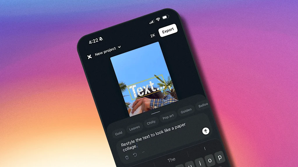
Why Rosalia's Instagram font went viral - a typeface designer unpacks the latest in personal branding

Instagram introduced a bespoke font, Rosalía.vt, enhancing personal branding through customized typefaces for content creators.
#lego
Typography
fromCreative Bloq
2 months ago

Netflix's Wednesday typeface is sheer genius

Tim Burton's Wednesday features a bespoke typeface that embodies the character's wit and thematic elements, enhancing the overall aesthetic experience.
Typography
fromNBC New York
2 months ago

Why do adults buy toys? According to experts, it's deeper than you think

Adults are driving the rapidly growing toy market, with Gen Z integrating toys into fashion.
Typography
fromHackernoon
9 months ago

How to Refine AI-Generated Typefaces with Interface Sliders | HackerNoon

The article outlines a design interface for generating and refining AI-generated typefaces through user interaction.
Typography
fromHackernoon
9 months ago

Create Custom Logos Using TypeDance's 5-Step Process | HackerNoon

TypeDance facilitates personalized generation of semantic typographic logos through a structured workflow involving ideation, selection, generation, evaluation, and iteration.
Typography
fromHackernoon
9 months ago

Typography Just Got Smarter (And a Lot More Expressive) | HackerNoon

Semantic typographic logos must balance readability with expressiveness, assessed by TypeDance using a pre-trained CLIP model.
Typography
fromItsnicethat
2 months ago

Slide Tackle Font from Los Crises follows in the footsteps of red card kings

Transforming unique marks into a legible alphabet while keeping energy and randomness led to an open-source font embraced by football fans and designers.
fromwww.theguardian.com
2 months ago

Can you solve it? Ambigrams you won't believe these flipping words!

Douglas Hofstadter is possibly best known for coining the term ambigram in 1983. An ambigram can be read in more than one way, commonly exhibiting left-right mirror symmetry or 180-degree rotational symmetry.
Typography
Typography
fromwww.theguardian.com
3 months ago

Australian woman who introduced the hula hoop to the world but missed out on the profits dies aged 101

Joan Anderson introduced the concept of the hula hoop to America, yet received no credit until 2018, despite the product's massive success.
[ Load more ]