UX design
fromMedium
3 days agoDon't simply bolt on AI. Rethink from the ground up.
AI represents a paradigm shift in design, allowing users to specify intent rather than commands.
Biophilic lighting replicates the spectrum, dynamics, and intensity of daylight by integrating seamlessly into architectural spaces. It transforms sterile interiors into environments that nurture health, enhance productivity, and promote mental balance.
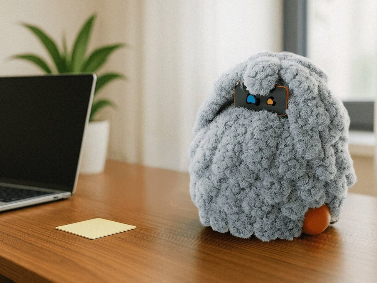
POCO addresses concerns around AI dependency by proposing a relational framework where the system functions alongside the user without assuming authority, focusing on responsiveness and maintaining visible boundaries.
The Container 26L is designed to adapt across environments rather than anchor itself to just one, showcasing a blend of rugged utility and refined design.
'When I go to bed, I go to work.' Starck describes dreaming as an active method in his design process, where sleep becomes a space for production and innovation.
NUMA introduces a visual layer that operates independently of the existing structure, allowing it to be implemented across different elevator types without structural intervention.
The original Xbox prototype, revealed at GDC 2000, was a massive X carved from a single block of aluminum, reportedly costing around $18,000 per unit.