


Showcase your services, projects, team, and brand story with a clean, responsive design that converts visitors into clients.
Web design
Web design
[ follow ]
Web design
fromLondon Business News | Londonlovesbusiness.com
3 weeks agoSeven leading hosting providers for small businesses that need reliable performance - London Business News | Londonlovesbusiness.com
Small business owners should prioritize uptime, speed, and support quality when choosing a hosting provider.
Web design
fromYanko Design - Modern Industrial Design News
4 weeks agoPixel 10a Just Proved a Smartphone Color Can Actually Mean Something - Yanko Design
Google's Pixel 10a Isai Blue celebrates individuality through a unique color and exclusive designs by artists with disabilities, marking a significant cultural expression.
#ai-design-tools
Web design
fromTheregister
1 month agoGoogle offers voice-driven 'vibe design' tool to build UIs
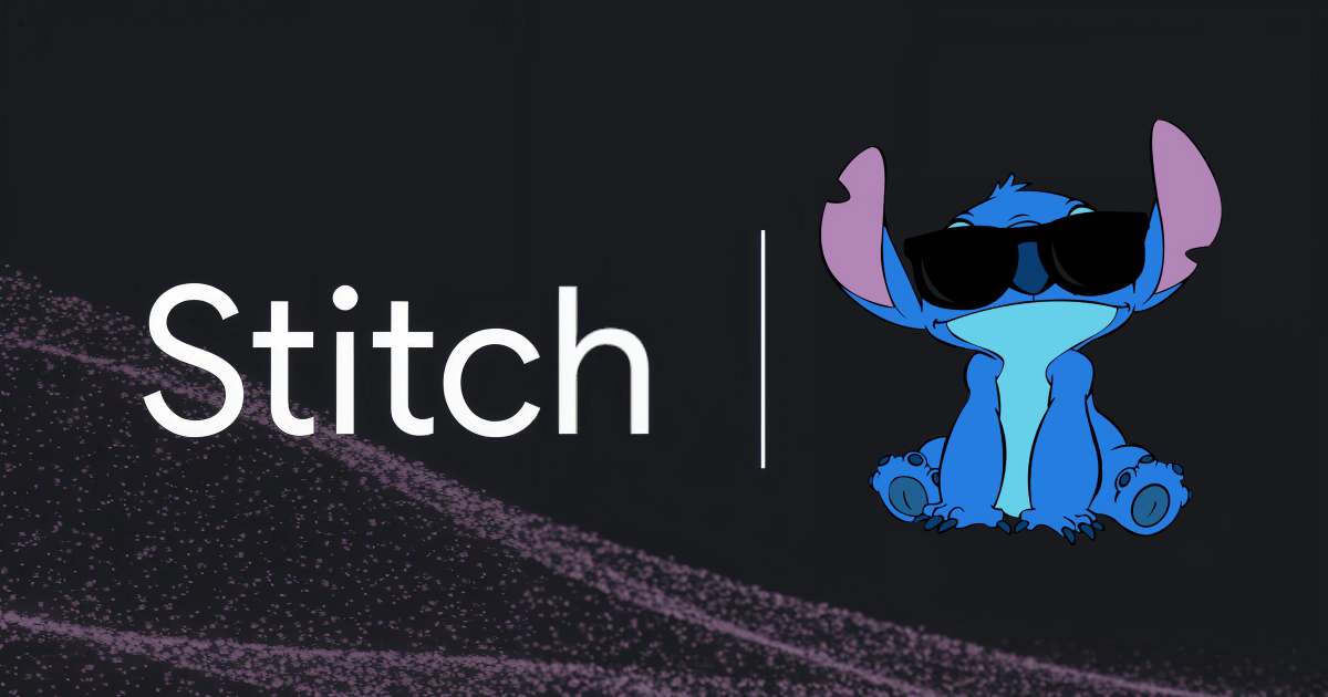
Google's Stitch design tool enables 'vibe design' by allowing developers to create UI prototypes through natural language descriptions and voice commands, with AI agents providing real-time design feedback and iterations.
Web design
fromwww.businessinsider.com
1 month agoGoogle declares 'vibe design' is here as Figma's stock price sinks
Google introduced 'vibe designing' through Stitch, an AI tool generating UI designs and front-end code from simple prompts, directly competing with traditional design software like Figma.
fromgizmodo.com
1 month agoNothing Headphone A vs. Headphone 1: Which Pair of ANC Wireless Headphones Wins?
While both pairs of wireless headphones share a similar look overall, there are actually some major design differences worth noting. One of the biggest differences is in color. While the Headphone 1 come in just black or white, the Headphone A expand the color options to include pink and yellow in addition to black or white, though the latter is limited edition.
Web design
fromTechCrunch
1 month agoKagi brings its 'small web' of a human-only internet to mobile devices | TechCrunch
The "Small Web," in Kagi's definition, includes sites created by individuals, like personal blogs, webcomics, independent videos, and more. These are the types of properties that formed the basis of the early web, before it became dominated by ad-supported business models and platforms controlled by large corporations.
Web design

Web design
fromThe Verge
1 month agoYou can now ask Photoshop's AI assistant to edit images for you
Adobe launches agentic AI features across Creative Cloud apps, enabling users to edit images and documents through conversational chatbot interfaces in Photoshop, Acrobat, and Express, with integration into Microsoft Copilot and ChatGPT.
Web design
fromYanko Design - Modern Industrial Design News
1 month agoThis titanium 'Spork' multitool packs 6 functions in a single unibody design - Yanko Design
The SPD Ti-Spork Chop is a unibody multitool combining spoon, fork, bottle opener, can opener, and prybar in one durable piece with pocket clip and lanyard hole for EDC portability.
fromGitHub
1 month agoGitHub - GLINCKER/thesvg: 3,800+ brand SVG icons for developers. Tree-shakeable, typed, open source. npm i thesvg
3,847 brand icons with multi-variant support (color, mono, light, dark, wordmark). Tree-shakeable npm package - import one icon, ship only that icon. TypeScript types for every icon module. Instant search with fuzzy matching and keyboard shortcut (Cmd+K / Ctrl+K). Filter by category - AI, Software, Framework, Language, Design, and more.
Web design
fromFast Company
1 month ago'Your AI slop bores me': The viral website that lets humans answer your questions like ChatGPT
In a world looming with the threat of ai stealing your job, save humanity by stealing ai's job. According to Maroju, inspiration for the site came from a frustration for AI art and its proliferation, making artists' lives worse and also just filling the Internet with low-effort generic slop.
Web design
[ Load more ]